Monjin
Monjin
Building a Cohesive Brand & Web Presence
Building a Cohesive Brand & Web Presence

// Project Context
// Project Context
// Project Context
Monjin operates at the intersection of talent intelligence and interview technology, helping companies access vetted expertise through AI-assisted workflows. This project focused on refining Monjin’s visual identity and digital presence to strengthen professionalism, clarity, and brand consistency. Rather than addressing a conventional UX problem, the work centered on elevating how the brand communicates, scales, and presents itself across identity and web touchpoints.
Monjin operates at the intersection of talent intelligence and interview technology, helping companies access vetted expertise through AI-assisted workflows. This project focused on refining Monjin’s visual identity and digital presence to strengthen professionalism, clarity, and brand consistency. Rather than addressing a conventional UX problem, the work centered on elevating how the brand communicates, scales, and presents itself across identity and web touchpoints.


// Branding & Collaterals
// Branding & Collaterals
// Branding & Collaterals
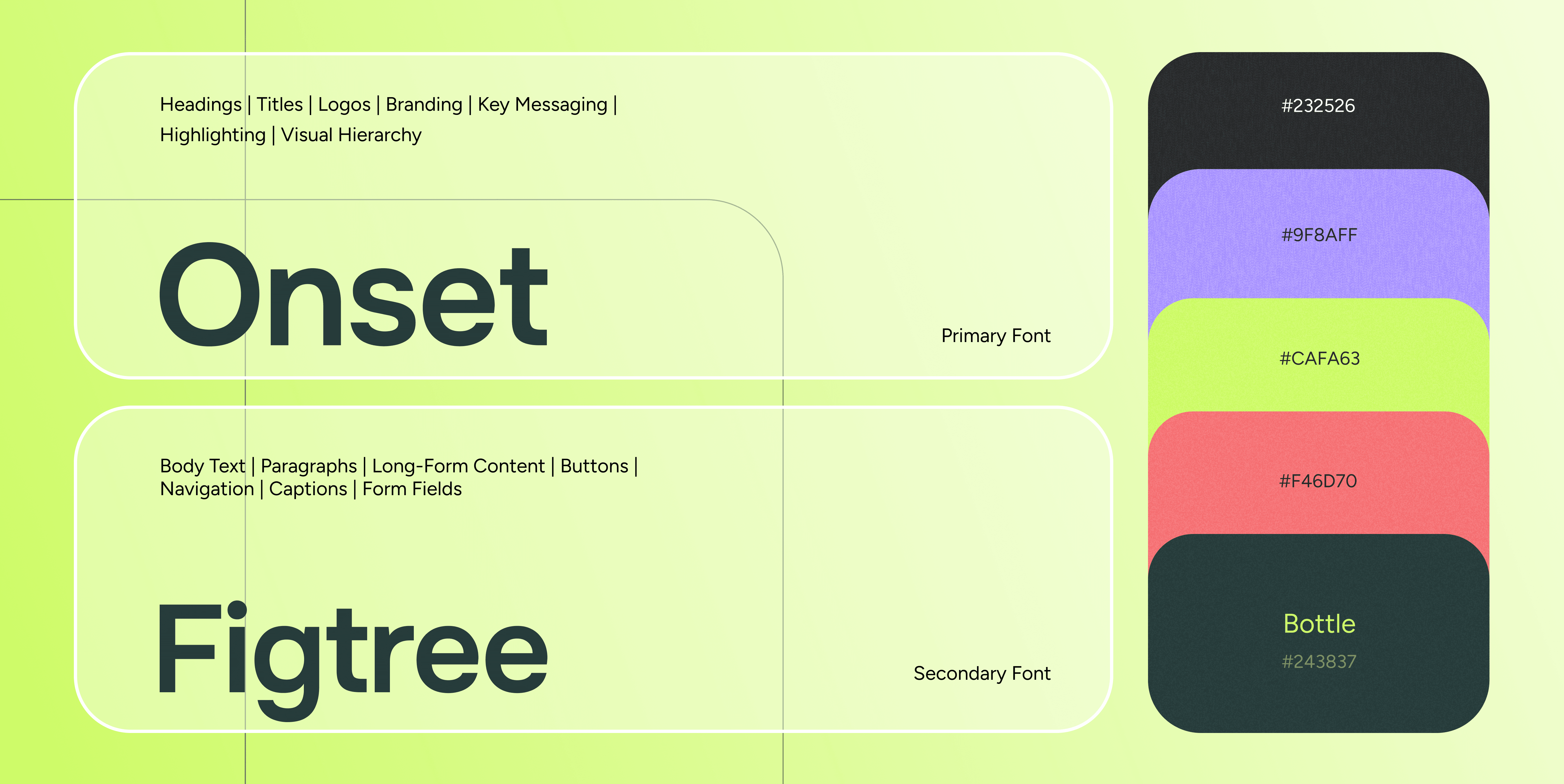
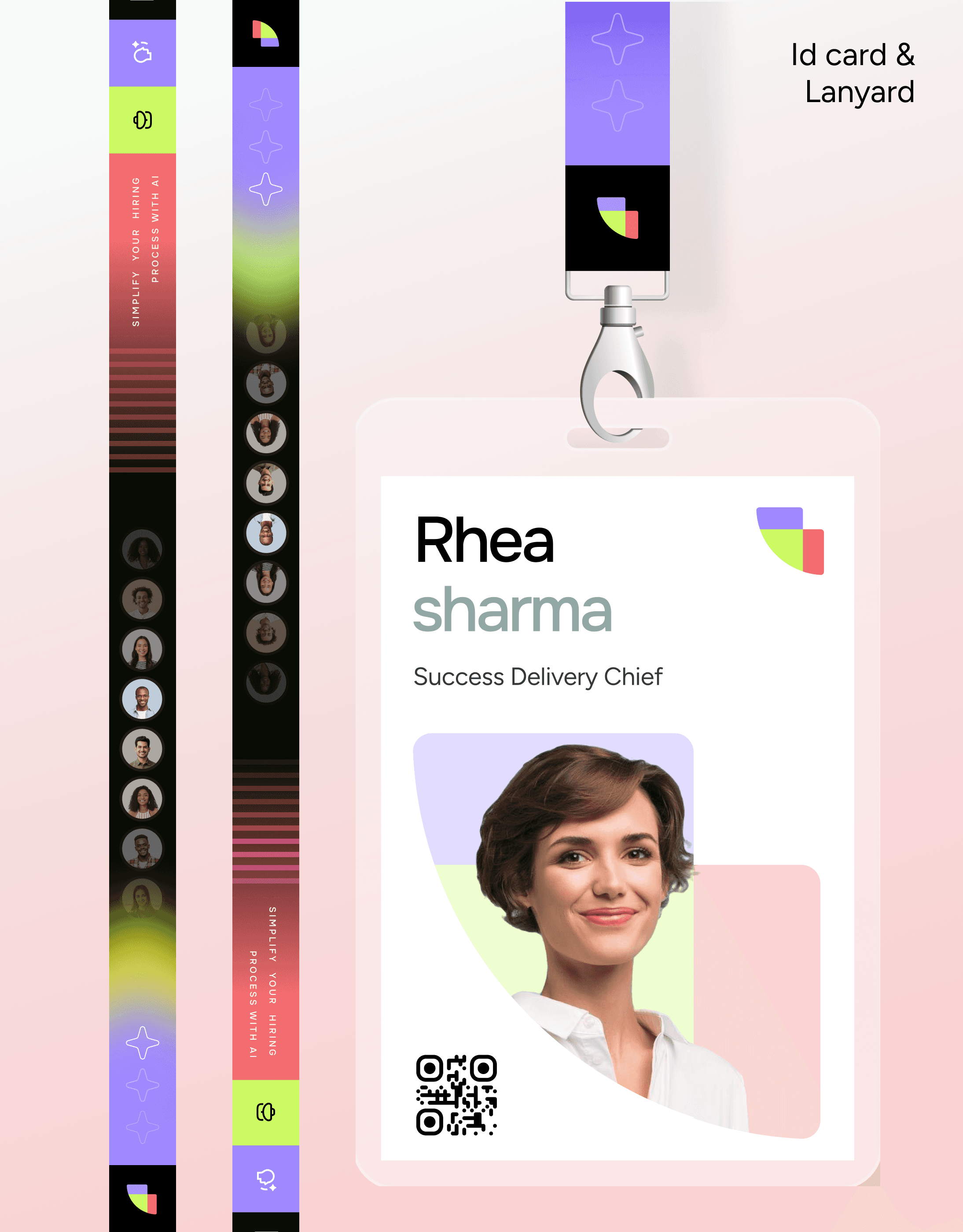
The branding work focused on building a cohesive visual system that could scale consistently across digital and physical touchpoints. The identity was refined to feel modern, professional, and confident, while remaining flexible enough to adapt across different formats and use cases.
Collaterals were designed as extensions of the core brand system rather than standalone assets. Color, typography, spacing, and visual elements were applied consistently to reinforce recognition and maintain clarity across every interaction.


// Website
// Website
// Website
The website redesign translated the refined brand system into a clear, structured digital experience. The focus was on improving content clarity, visual hierarchy, and overall readability while maintaining a consistent brand tone. The final website presents Monjin as a confident, modern platform with a strong emphasis on clarity and ease of understanding across all pages.
The website redesign translated the refined brand system into a clear, structured digital experience. The focus was on improving content clarity, visual hierarchy, and overall readability while maintaining a consistent brand tone. The final website presents Monjin as a confident, modern platform with a strong emphasis on clarity and ease of understanding across all pages.


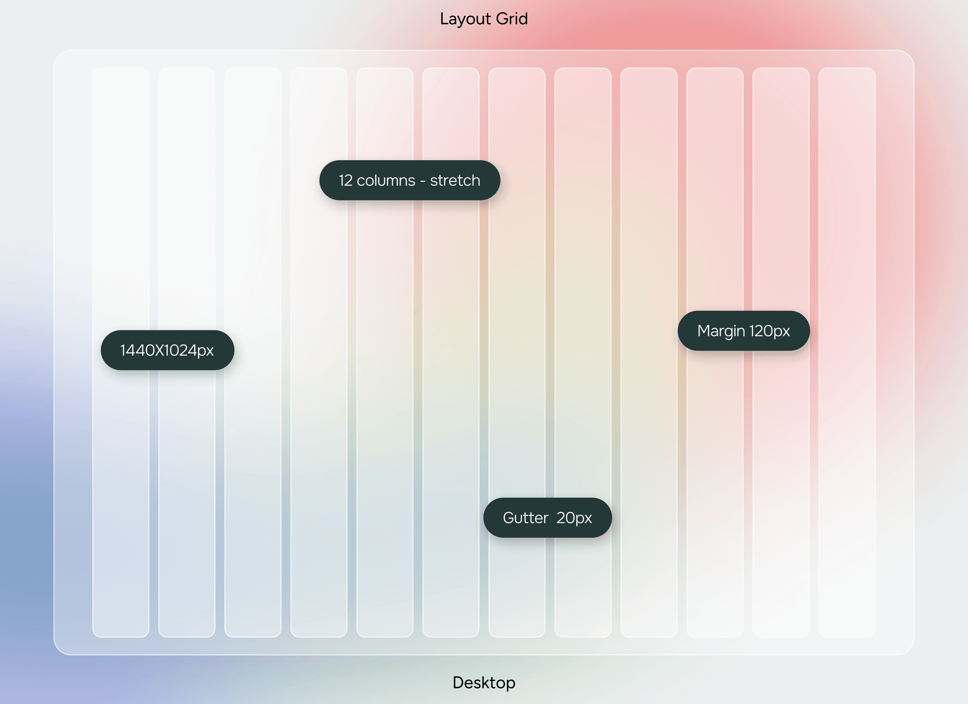
// Information Architecture & Layout System
// Information Architecture & Layout System
// Information Architecture & Layout System
The website structure was designed to guide users through Monjin’s offerings with minimal cognitive load. Content was organized into clear sections with predictable flow, allowing users to quickly understand products, features, and value propositions. A modular grid system was used to maintain consistency across pages while allowing flexibility for different content types.
Typography hierarchy, spacing, and alignment were carefully refined to support scannability and visual rhythm. Reusable layout patterns ensured cohesion across the site, while strategic emphasis helped key information stand out without overwhelming the interface.


// The refined identity and digital presence have strengthened Monjin’s professional posture and brand clarity. Visual decisions emphasize confidence, legibility, and scalability creating a foundation for future growth.
// The refined identity and digital presence have strengthened Monjin’s professional posture and brand clarity. Visual decisions emphasize confidence, legibility, and scalability creating a foundation for future growth.
" height="27.930819148222607px" id="biIEmEXkG" transform="translate(2.438 3.048)" width="25.044114687347403px"/><path d="M 11.079 8.075 C 11.079 6.281 3.043 9.713 3.043 4.72 C 3.043 2.185 5.968 0 10.377 0 C 16.384 0 20.753 4.369 20.753 10.377 C 20.753 16.384 16.384 20.753 10.377 20.753 C 4.369 20.753 0 16.384 0 10.377 C 0 9.245 0.468 7.685 2.926 7.607 C 5.266 7.529 6.827 8.894 9.284 8.894 C 10.103 8.894 11.079 8.621 11.079 8.075 Z M 4.876 10.377 C 4.876 16.033 7.178 20.168 10.377 20.168 C 13.575 20.168 15.877 16.033 15.877 10.377 C 15.877 4.72 13.614 0.585 10.064 0.585 C 8.231 0.585 6.905 1.755 6.905 3.394 C 6.905 7.295 12.873 4.408 12.873 6.944 C 12.873 8.426 11.001 9.479 9.089 9.479 C 7.919 9.479 6.866 9.167 5.851 9.167 C 5.266 9.167 4.876 9.479 4.876 10.377 Z" fill="rgb(255, 195, 11)" height="20.75306667120798px" id="CzSskYKKY" transform="translate(24.389 10.85)" width="20.753066666666673px"/><path d="M 6.476 0.624 C 6.164 4.954 5.5 9.323 5.5 13.653 L 5.695 13.653 C 5.695 5.383 9.011 0 13.38 0 C 16.306 0 17.515 1.287 17.515 3.901 C 17.515 5.812 16.579 9.323 16.579 13.653 L 16.774 13.653 C 16.774 5.383 20.09 0 24.459 0 C 27.385 0 28.984 1.677 28.984 4.291 C 28.984 6.437 28.399 10.572 28.399 13.146 C 28.399 16.618 29.53 19.739 31.481 19.739 L 31.481 20.129 L 26.097 20.129 C 24.381 18.53 23.601 16.696 23.601 14.16 C 23.601 11.157 24.303 7.022 24.303 4.525 C 24.303 3.355 24.03 1.989 22.352 1.989 C 19.934 1.989 17.359 6.359 17.359 13.653 C 17.359 16.618 18.452 19.739 20.402 19.739 L 20.402 20.129 L 15.019 20.129 C 13.302 18.53 12.522 16.696 12.522 14.16 C 12.522 11.157 13.224 7.022 13.224 4.525 C 13.224 3.355 12.951 1.989 11.274 1.989 C 8.855 1.989 6.281 6.359 6.281 13.653 C 6.281 16.618 7.373 19.739 9.323 19.739 L 9.323 20.129 L 0 20.129 L 0 19.739 C 1.17 19.739 1.482 19.544 1.482 17.788 L 1.482 2.965 C 1.482 1.209 1.17 1.014 0 1.014 L 0 0.624 Z" fill="rgb(255, 195, 11)" height="20.128914285714288px" id="QXUPAOXY5" transform="translate(2.438 40.107)" width="31.480685714285734px"/><path d="M 14.16 20.129 C 14.473 15.799 15.136 11.43 15.136 7.1 L 14.941 7.1 C 14.941 15.76 10.572 20.753 4.915 20.753 C 1.989 20.753 0 19.076 0 16.462 C 0 10.181 11.625 11.976 11.625 9.245 C 11.625 7.451 3.979 9.674 3.979 4.681 C 3.979 2.146 6.905 0 10.923 0 C 16.579 0 19.154 3.472 19.154 6.905 L 19.154 17.788 C 19.154 19.544 19.466 19.739 20.636 19.739 L 20.636 20.129 Z M 4.876 16.228 C 4.876 17.398 5.539 18.764 7.412 18.764 C 11.157 18.764 14.356 14.395 14.356 7.1 C 14.356 2.965 12.951 0.585 10.611 0.585 C 8.894 0.585 7.841 1.521 7.841 3.004 C 7.841 6.944 13.419 5.578 13.419 8.114 C 13.419 11.625 4.876 11.43 4.876 16.228 Z" fill="rgb(255, 195, 11)" height="20.75306670299713px" id="qLhLniaih" transform="translate(32.35 40.107)" width="20.636038095238092px"/><path d="M 6.281 24.966 C 6.281 26.722 6.593 26.917 7.763 26.917 L 7.763 27.307 L 0 27.307 L 0 26.917 C 1.17 26.917 1.482 26.722 1.482 24.966 L 1.482 2.341 C 1.482 0.585 1.17 0.39 0 0.39 L 0 0 L 6.281 0 Z" fill="rgb(255, 195, 11)" height="27.306666666666665px" id="T5dzxRrDQ" transform="translate(53.376 32.929)" width="7.762895238095233px"/></svg>)